Pages

Tuesday, January 31, 2012

Pillowcase Pillow Mattress

I just realized that a lot of my posts will probably have two common themes. First of all, there will probably be a lot of posts that are about some type of hand-me-down item that was given to me by a family member. Second, many of my posts will probably be about projects that I have created for my daughters.

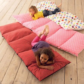
My mother-in-law gave me a stack of old pillowcases and bedsheets that were all in really good condition. We've used many of them on our beds, but some of the pillowcases I set aside until inspiration struck for a project. Thank you Pinterest, this fun mattress popped up and I knew what I could use them for.

(from here)


After doing some research and seeing tuturorials out there from others who had tried to recreate this, I knew that they hadn't used individual pillowcases. Most people had used a solid piece of fabric and then sewn across to create the five pockets. Since I already had the pillowcases on hand so I decided to give it a try.

For my first attempt I just sewed all five pillowcases together. It turned out like this:


It was great, I bought five of the dollar pillows from IKEA to put in the cases, and it was perfect for a two-year old to use for over night trips. She even slept on it for almost two weeks straight while we were refinishing the wood floors in the upstairs bedrooms. As you can see, it was plenty long and a little bulky to carry around. The pillowcases were also pretty loose around the pillows, so there were big gaps between the pillows. So, I decided with a little unpicking and a little cutting, that the pillow mattress could be improved.

I measured the pillows and found that they were about 17 inches long, so I cut off about 3 inches from one side on each of the four of the pillowcases. I decided to only use four instead of five this time.


I then turned the inside out and sewed the back together. Then I sewed all four of them together again. I also top-stitched over the little flap created from the seam from sewing the together just to make it look a little more finished. This is what my second attempt left me with:


It was much less bulky this time. The perfect size for my toddler with some room to grow. The gap between the pillows is much smaller. I still think that I will add some Velcro or ribbon ties to the open edges of the pillowcases to help keep the pillows in a little bit better. My little bug thinks that it is great to pad her landing when she jumps down the stairs.


-Mandi

Linking here to The Space Between & here to Blue Cricket Designs.

Sunday, January 29, 2012

A Little Bit About Me


Hi, my name is Nicole, Nic, Cole, or Nickel. Sometimes I even get called Michelle or Mandi and I'll answer. I think Michelle put it best when she said, "I'm a foreigner in the blog world." I too am a foreigner starting on this new frontier. So here I go.
I am the youngest of the three of us sisters and as such I used to say all of the creative genes ran out before they could get to me. Then one day I realized, I do have a spark of creativity in me! What a day. Because I discovered my own creativity I agreed to participate in this blog to share that "spark" with the blogging world. Watch out world.
As Mandi mentioned before I am recently married to my best friend David. He is a ball of energy who keeps me laughing and going all the time. He's a very understanding husband. When my "spark" decides to hit he patiently answers what color he thinks looks best, how high the eyes should go, and yes I'll sand this part of the dresser.


We both love to be active and play. Anything done outside is better. Anything done in the mountains is best.
We love to travel and see new places. We both have a bit of a nerdy side and enjoy, reading, Rubik's Cubes, mind games, and puzzles. We both have a love for languages and both are working on our third one.
We love to cook together. We are constantly trying out some awesome new recipes and some not so awesome recipes.
I am a college graduate working full time with more time on my hands then I know what to do with. All this newly found time has been great to help fuel my "spark". 
So help fuel the "spark", create.

Friday, January 27, 2012

Liebster Blog Award


In German Liebster means beloved, favorite, dearest. This award is given out by fellow bloggers to up and comers with less than 200 followers, encouraging new friendships and community.

Upon receiving the Liebster award, you do the following:

1. Post the award on your blog for the world to see!
2. Show your thanks to the blogger who awarded you the Liebster by linking back to them.
3. Reveal your 5 picks for the award and let them know they’ve been chosen.
4. Bask in the love from the most supportive people on the blogosphere…other bloggers!
5. Finally, the best rule of all, have fun and spread the love!

Thanks to everyone who has been reading our little blog. It is exciting to have people checking out our posts. It is great to be a part of the blogging community and to try and network with all of the amazing people who are out there.

Thanks to Bri at the Modern Parsonage for giving us this award. She has a great blog with DIY projects and the renovations that she has been doing on her home.

Choosing five other blogs to pass this award onto was fun. I could spend way too much time blog hopping and checking out what cool projects other people are doing. So, here is my list:

1. ReesiePie Creations - Darcee is an extremely talented mom who loves making clothes for her young daughter. She doesn't have any formal sewing training but is able to look at something and find a way to recreate it for her little one.

2. The Massif Project - This is a shout out to my younger brothers. They love anything outdoors related and spend a lot of time enjoying mother nature. Their blog is a way for them to share their love of adventure and to encourage others to be active as well.

3. My Recipe Boxx - Britni has some amazing recipes posted here. She has a great variety of recipes, great pictures of all of her culinary creations, and is always trying new things.

4. Craft Me This - Liz is another talented sewer. She is always coming up with great projects for her two little girls, and has so many fun posts.

5. Sisters, Sisters - This blog is a family effort to post fun projects, tutorials, and tips. It is great to see other sisters teaming up to share their talents and ideas.

So, if you are looking to do some blog hopping, you should check out these great blogs.

Wednesday, January 25, 2012

4 Day Weekend + 1,400 m = 3 National Parks

I'm a foreigner in the blog world and I feel like I might need a tour guide. Don't get me wrong, I'm all for adventure and new frontiers, in fact you might say I thrive on it (see photo proof below). I just don't know if I'll ever have the cutest blog on the block or one hundred million followers.

I'm just a girl that likes to create. And I come from a family of creators. So we decided to share our creations, motivations, and our inspirations with a world wide audience.

Meet me, Michelle. And the biggest inspiration/motivation in my life, my husband Ben. He's really sweet and really good looking. I kinda like him.


We love to travel. We love to explore. We love to recreate in Mother Nature's playground. And recently we found a new love...

About 2 weeks ago, Ben brought home some longboards. After taking a few rickety painfully slow rides on a local nature trail, we started to get the hang of it. Sort of.

Well over MLK weekend, we found out it was free entry into the National Parks and knew we had to put our new skills to the test in the beauty of the desert. So we loaded the longboards up in the Subaru and headed south.

It was amazing. Breathtaking. Nature is the best inspiration around. We skated, explored, and just marinated in the beauty of the red rock. Ben took some footage of me longboarding and put together a little clip. If you can get past the beginner riding and lack of flashy tricks, you'll be able to appreciate a small taste of the beauty all around.


And if that didn't do it for you, some pics of the grandeur. Grand Canyon and Bryce Canyon (the best pics we had of Zion are not on the other computer and I'm too lazy to transfer them over or do any editing right now). Enjoy the snapshots!


So get out and enjoy the fresh air. Nothing like the great outdoors to give you the inspiration you need to create.

-Michelle

Tuesday, January 24, 2012

Easy Dresser Makeover

When we first moved into our house we were given a lot of hand-me-down furniture. We didn't say no to anything because we didn't know exactly what we would need, and of course we didn't have money to go buy any new furniture.


This dresser came from my mother-in-law. She bought it used 35 or so years ago for $5 when they were living in Iowa going to dental school. It was passed down through her children over the years, and then it sat in their garage for a long time holding tools and a few odds and ends. It was pretty banged up, but I figured that a couple of fresh coats of paint would probably go a long way towards making it look good again.


Of course at one point over the years this dresser was my husband's, and he had written his name in one of the drawers.

To start off,  I did a coat of light sanding with my Mouse sander, and then I primed it. I also wanted to add some decorative detail and had some of the Allen and Roth paintable wallpaper on hand. I chose a part of the pattern that I liked and cut out individual pieces to fit around the drawer pulls. I applied them like the wallpaper directions advised, waited 24 hours for them to dry, and then the painting began. I used Sherwin Williams Alabaster white, and did two coats, applying it with a small furniture roller. I also spray painted the drawer pulls with Oil Rubbed Bronze spray paint, because they were pretty scratched up as well.


I wanted to see if I liked the drawers better a little distressed, or as they were. Surprisingly, I liked them better not distressed, so I just left them how they were.


And here is the old brown dresser with some nice white paint and all put back together again. It turned out cute enough that I thought it would be a nice addition to my 2-year old's big girl room. It is far from perfect and there are still some dents and dings in it, but I am happy with it. It was free and I figured that in a toddler bedroom it would probably get many more dents and dings anyway, so not too bad for about 3 hours of work. 

Here is a side by side comparison. It really is amazing what some elbow grease and some paint can do.

-Mandi

Linking here to Domestically Speaking's Power of Paint party.

Friday, January 20, 2012

Entertainment Center to Play Kitchen


I am still a little girl at heart. It makes me laugh that now as an adult, I can still get excited over cute play dishes and food, despite the fact that I get to "play house" cooking and doing dishes everyday.

Three years ago, when Michelle and I were at IKEA, we just couldn't say no to buying all of the toy pots and pans that they had there. I was probably 3 months pregnant with my first baby, and Michelle wasn't even married yet. So, basically we were indulging ourselves as a tribute to our childhood, knowing that it would still be years before they would actually be played with.

(Source)

Then, I had my first baby girl. I was so excited to start giving her all of the fun things that I was imagining for her. Ana White posted plans for a cute play kitchen that I was ready to start building for my six-month old even though we were living in a tiny two-bedroom apartment at the time. Then reality set in, and I realized that there was no need to rush things. Over the next year or so, I started filing away all of the cute play kitchens that everyone in blogland was making for their children. I was particularly inspired by this cute kitchen that was built from Ana White's plans.

I also found inspiration from all of the re-purposed play kitchens that I saw. There are so many creative and resourceful people out there turning nightstands, cupboards, and old entertainment centers into toy kitchens. After all of that, I knew how I could create a play kitchen with the look and feel that I wanted in an economical and resourceful way. 

In the spring of 2005, I was a newly wed and my parents' neighbors graciously gave us an old entertainment center that they were no longer using. Over the next six years, that little enertainment center was well-used. We handed it off to some friends when we moved, only to rescue it from the rain and weather when they abandoned it two years later. We used it again for awhile as an entertainment center until we upgraded to a television that wouldn't fit on it. Then it was used as storage for miscalleanous items until it was  passed off to my younger brother to use in his college apartment. This time I told him that I wanted it back when he was done with it because I had a project idea for it. So, in May of 2010, when we bought our  home, I ended up with the "little entertainment center that could" once again. This time it sat in my garage for a year until I was finally ready to give it the makeover that it deserved.

Unfortunately, I can't find a before picture of it, but the one below is pretty close to what it looked like, except that mine had doors on the long part of the L, a back, and was a little more dated.  Also, the tall part of mine was one piece with adjustable shelves, and the long section didn't have a divider.


I really wanted to finish the play kitchen for my 2-year old's birthday and came pretty close, but I got stuck on trying to make the fridge doors work, so she received all of the IKEA dishes and felt food with no kitchen to play with it in. I kept planning on finishing it, but I was pregnant again so it kept getting moved lower on the priority list. By this time, it was almost Christmas (6 months past the birthday deadline) and I was super motivated to get it done for the holiday. With some help from my husband, we finished it just in time. It was actually kind of embarassing how close I had been all along, just letting it sit when it probably would have only taken 2-3 hours to finish it up. So I finally had an inexpensive (probably around $40 for supplies) homemade play kitchen for my girls. 


My two-year old loves it, and has already spent hours baking  cupcakes and making lunch. There are still just a few spots that need touch-up paint, and the right fridge door still doesn't close all the way, but overall I am pretty happy with the way that it turned out. I have been saving some random plastic containers here and there that I am in the process of making labels for so that she has more food for the refridgerator. I can do another post on some of the details later, but some of my favorite things are: 
  • The faucet was salvaged from a family member who was getting new ones
  • The oven racks were only 50 cents each, a two-pack of cooling racks from the dollar store
  • The shelf to hold spoons and dishes
  • There is plenty of room to store dishes, food, and other treasures
  • The bright colored fabric in the curtain to cover the cupboard
-Mandi

Linking to this party at Design Dazzle. 

Thursday, January 19, 2012

Faux Tile Floor

As we were deciding what to do with the floor in the studio our goal was a floor that would be durable, easy to clean, and inexpensive.
 

What we had to work with-
  • An unfinished basement floor- old, cracked, chipped, cement (sorry no before picture).


What we did-
  • Filled the major cracks and chips with cement filler purchased from a hardware store.
  • Hired a cement cutter to score the floor into 12in x 12in squares (a messy job).
  • Purchased 4 different pint jars of oil based wall paint in cream, sienna and brown hues.
  • Used a sponge to layer and blend the paints on the cement.


What we have now-
  •  A floor (total cost under $200) that looks like tile and is great for all kinds of art projects. No worries when paint spills on the floor or when kids color on it with markers.

What I have learned-
  • The floor is durable. It has weathered several of years of use and abuse. The only real damage came when a pool table was drug across it while it was still curing. Other than that any little dings and chips are barely noticeable and seem to blend in with the paint colors used on the "tiles"
  • If we were to do this again we would  have the cement scored just enough to see an impression rather than cutting down through it. Our cuts are deep enough for little things to fall into. It is also deep enough that it looks like the floor is in need of grout between the squares. Otherwise I have loved my faux tile studio floor.
-Joanne


Wednesday, January 18, 2012

The Studio

When we moved into our home I staked claim to a large (20ft by 20ft) space in the unfinished basement for my studio. Almost 15 years later it became a reality. Although the walls could use a few finishing touches, this has become more than just my painting studio it's also a classroom, sewing room, meeting room and family project room. I love it!


Pretty much the entire project has been an exercise in reuse or D.I.Y. From the fake tile floor to the shelves and counter tops. Although these pictures are dark this room is actually very light.


 I planned what I wanted and my handy husband made it happen.


The box on the left is a big light table- a free find. With the cover on top, it doubles as a fabric cutting table.


A few adjustments on this second hand table made it into perfect mat cutting area. The bag on the side holds small mat scraps.


The closet in front on the right is for art supplies that didn't fit on the cubby shelves. The other closet is...


a sewing area.


Later I'll do separate posts on some of the different areas in the studio.
 -Joanne


Linking to Thrifty Decor Chick.


Thursday, January 12, 2012

Subway Art


(Source)
It was probably close to 2 years ago that I first saw this Pottery Barn picture and was inspired to try and create something with the same type of feel. I loved the ledge shelves, the photo arrangement, and the contrast of the black and white. I was especially inspired by the subway art. I really wanted to make something similar to hang in my living room that had some meaning for my family.

So, I went to my go to design program, PowerPoint. I had Photoshop at the time, but had never really learned how to use it. Let's just say that after a few hours of work, I had created something, but it wasn't quite what I wanted. PowerPoint was just too limited to do what I wanted with the subway art. This is what I was able to create the first go around, but I wanted to be able to manipulate the text more and add an aged, worn-out look to it.


I considered painting and distressing a wood sign to try and get the look I wanted, but had too many other things going on to worry about it. Ana White posted plans for building ledge shelves on her blog, which I was really excited to get started on. (More on that later) That is actually part of the whole creative process that I am continually learning about. Sometimes, there are hang-ups and frustrations that may keep you from completing something. It is okay to have multiple projects going on at once. It is okay to start something new even when you have been working on something else. I was really unable to create the subway art that I wanted to the way that I wanted to do it, so it was time to move onto something that I could make progress on.

Fast forward to the fall of 2011. I had a new baby and wanted to send out birth announcements. I had some free Shutterfly prints and so I needed non-traditional 4x6 sized announcements and really didn't know how to use one of the cute templates they offered to do that. So, after some Google searches, calls to my sister about her Photoshop knowledge I was able to create a birth announcement that I was happy with. That also gave me some confidence that Photoshop really wasn't some big scary program, but that with some patience, and lots of trial and error,  I could use it to create many of the projects that I wanted to.

I was ready to pull out my old subway art project and try it again in Photoshop. I downloaded some new fonts from dafont.com to help create a washed out look, used some brushes within Photoshop to age the appearance even more, and within about an hour had something that I was ready to display. I printed it at Costco for about $3.00, and after almost two years, finally created something that I was happy with that also had some meaning for my family.  I used dates that had special meaning such as birthdays and anniversaries, as well as places that we have lived.


-Mandi


Wednesday, January 11, 2012

First Post


This blog has been in the works for a long time. We have talked about it for years, finally finding the inspiration and motivation to get it started. All of us have the desire to create. We all have different talents, are at different stages in life, and sometimes create in different ways, but the desire is the same. We are trying to create homes and lives that inspire us and our families.

We find our inspiration from so many places. Pinterest and the blogs of so many other talented people have provided us with countless ideas for how and what we create. We also find inspiration from our families, friends, and from each other. We can brainstorm together, work through hang-ups together, and motivate each other to continue creating.

Our motivation for this blog is to have a place for us to share what we create, what inspires us, and to keep us motivated to keep doing what we love.